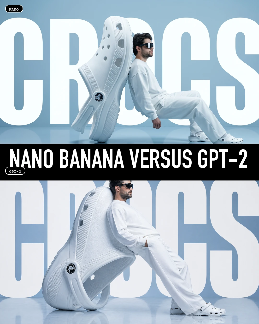
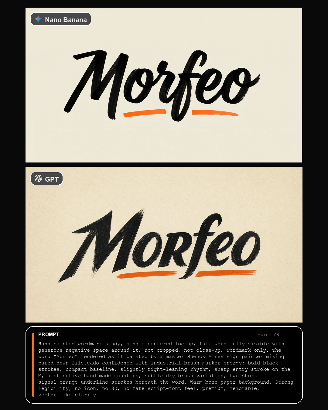
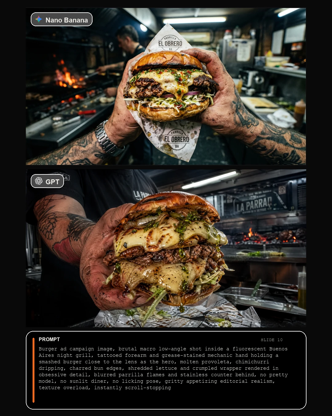
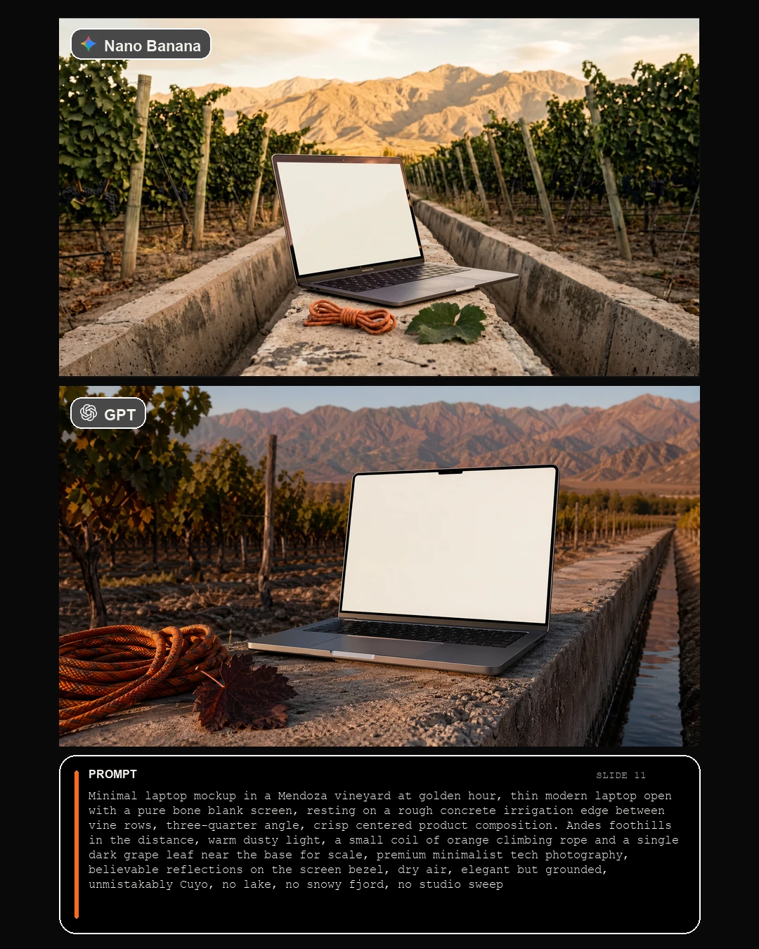
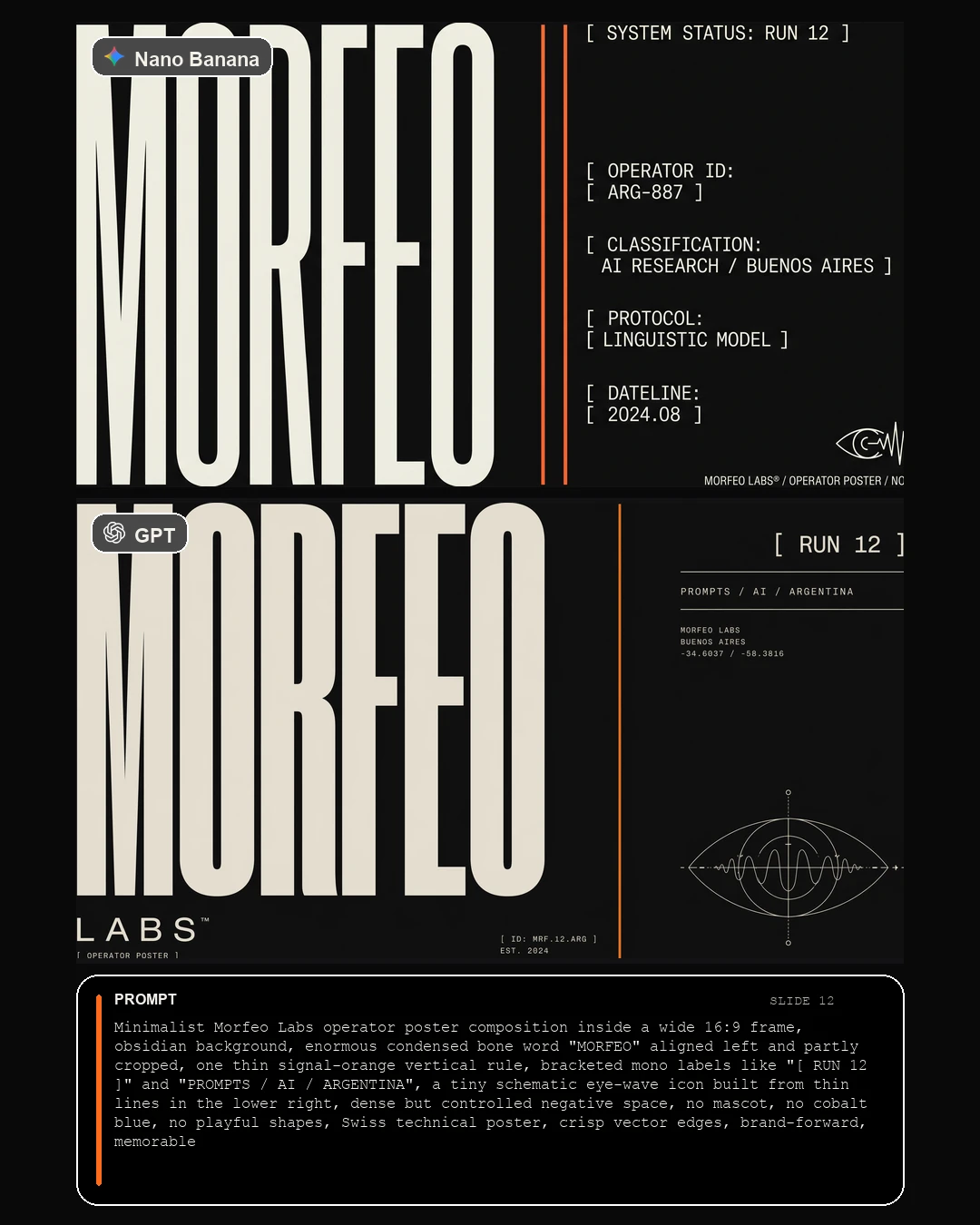
Recurso completo · Morfeo Academy

Nano Banana
versus GPT-2

La guia completa del carrusel: portada, 11 comparativas, CTA final, todos los prompts y las decisiones que usamos para tensionar ambos motores con una direccion visual bien Morfeo y bien argentina.

El criterio del test fue simple: mismo prompt, mismo ratio, distinta maquina. Arriba corre Nano Banana. Abajo corre GPT. El prompt se compone fuera del render para que la comparativa sea limpia, legible y realmente util.

13 slides finales
11 prompts comparativos
2 motores por slide
5+ locaciones argentinas

Nota editorial: en la portada y en el carrusel dejamos GPT-2 porque asi se pidio la pieza. Operativamente, la tanda inferior del test corresponde a GPT Image 2 / effort medium.

Portada Nano Banana versus GPT-2
Portada final exportada a 1080 x 1350 para Instagram.
Framework de comparacion

Lo que mantiene honesto el test.

Si cambias el prompt, cambias la pregunta. Por eso el sistema del carrusel esta hecho para comparar motores, no para mezclar briefs.

Mismo texto

El prompt es el mismo arriba y abajo. Lo unico que cambia es el motor.

16:9 adentro, 4:5 afuera

Primero generamos horizontales 16:9 y despues componemos el carrusel final.

Argentina como stress test

Bariloche, Mendoza, Jujuy, Buenos Aires e Iguazu obligan a concretar mejor.

Texto fuera del render

La tipografia del prompt y los labels viven en composicion, no dentro de la imagen.

Como usar esta guia.

Si queres recrear el carrusel, hacelo en este orden: elegi el tipo de imagen, adaptalo a una escena o paisaje concreto, corre ambos motores con el mismo prompt, elegi el ganador por categoria y recien ahi arma la portada y el CTA.

  • Arriba siempre: Nano Banana 2K en horizontal 16:9.
  • Abajo siempre: GPT Image 2 en effort medium, tambien 16:9.
  • Composicion: export final a 1080 x 1350 con prompt abajo.
  • Portada: puede salir de una slide ganadora, no de un experimento aparte.
Promptbook completo

Todas las slides, con el prompt exacto.

Aca esta la pieza entera: la tapa, las comparativas una por una y el cierre. Cada imagen que ves ya esta compuesta como salio el carrusel final.

Slide 01 · Cover

Portada / Split poster hero

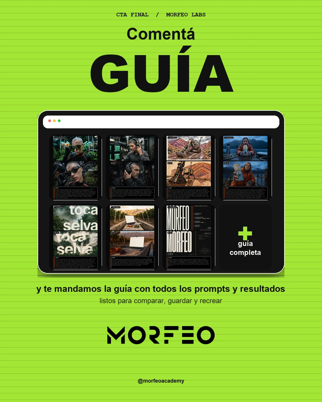
La portada toma la estructura del posteo de referencia: una horizontal arriba, otra abajo y un titulo blanco gigante cruzando el medio. Para generarla usamos un prompt base high-fashion y despues compusimos la division y el titulo en post.

Cover High-fashion Prompt base + composicion
Prompt base
High-fashion surrealist advertising poster for Crocs, 16:9 horizontal composition. Minimalist monochrome powder-blue studio with a semi-reflective glossy floor. The central focus is an oversized giant white Croc clog positioned on its heel at a diagonal angle, acting as a sculptural backrest. A male fashion model matching the attached face reference leans his entire back against the giant shoe in a relaxed side-profile pose, facing right, looking ahead with a serene expression. He has thick dark brown hair, light stubble, strong brows, pale green eyes, and wears luxurious futuristic oversized black mirrored wraparound sunglasses inspired by high-fashion shield eyewear. He is dressed in a clean all-white coordinated sweatshirt and wide-leg trousers and wears standard-sized white Crocs. In the background, the word CROCS appears in massive bold white condensed sans-serif typography, partially occluded by the giant shoe and the model to create depth. Soft cool even lighting, gentle shadows, subtle floor reflection, clean modern high-concept luxury campaign aesthetic, full-bleed, no border, no mockup, no watermark, no small captions, no extra text besides the giant CROCS background word.
Slide 01 portada del carrusel
La division superior e inferior y el titulo se agregaron en composicion.
Slide 02 · Comparison

Eyewear / Bio-optic Operator

Testeamos realism + product hero con cuerpo, laboratorio y naturaleza. La imagen tenia que sentirse humeda, rara, clinica y organica al mismo tiempo.

Editorial realism Product hero Biolab
Prompt compartido
Bio-optic eyewear campaign image, extreme close-up low-angle wide-lens shot of an androgynous operator emerging from a humid sealed biolab greenhouse at night, mirrored cat-eye visor sunglasses as the absolute hero, one black latex-gloved hand lifting the frame for inspection, shaved silver buzzcut, wet skin with tiny metallic freckles, black neoprene operator suit with signal-orange seam lines, dense ferns, condensation, stainless pipes and glass walls in the background, obsidian + moss + signal-orange palette, exaggerated perspective distortion, premium editorial realism, body-tech-nature crossover, sharp product detail, strange, elegant, instantly scroll-stopping
Slide 02 comparativa bio-optic operator
Nano arriba, GPT abajo, mismo prompt.
Slide 03 · Comparison

Headphones / Control-room Operator

Aca queriamos operator-machine real, no rooftop fashion. El brief estaba escrito para sacar del medio el cielo azul y obligar una atmosfera de sala tecnica.

Headphones Operator Industrial precision
Prompt compartido
Headphones campaign image, dramatic medium close-up of a middle-aged operator inside a dark machine control room, premium over-ear headphones as the clear hero, one scarred hand adjusting the earcup, cropped salt-and-pepper hair, tired intelligent face, charcoal utility coveralls with subtle signal-orange tabs, obsidian walls, CRT monitors, cable bundles, pressure gauges and thin steam in the background, strong side light, no sky, no rooftop, no generic fashion pose, operational Morfeo Labs aesthetic, industrial precision, sharp product detail, cinematic but believable, instantly scroll-stopping
Slide 03 comparativa headphones control-room operator
Esta pareja era candidata natural para subir a portada.
Slide 04 · Comparison

Morfeo Biotech Poster

Aca el test era tipografia compleja + biotextura. La consigna fue mantener fondo oscuro, alta legibilidad y evitar el tipico glow azul generico.

Poster Typography Biotech
Prompt compartido
Experimental biotech poster composition inside a wide 16:9 frame, obsidian-black background, oversized uppercase word "MORFEO" centered in heavy condensed technical sans, warm bone letterforms spanning almost the full width. From the counters and outer edges of the letters emerge translucent amber membranes, cartilage ribs, capillary threads and wet latex folds as if the word were incubating inside a sealed lab. One thin signal-orange bracket line on the left, tiny operator labels, no extra accent colors, no gradients, no mascots, no blue glow. High legibility, eerie but controlled, premium Swiss-tech meets biotech poster
Slide 04 comparativa poster biotech Morfeo
Sirve para medir control tipografico y textura sin perder lectura.
Slide 05 · Comparison

Siete Colores Survey Robot Illustration

Esta slide fuerza ilustracion gestual, robot y un paisaje argentino inconfundible. La clave fue sacar cualquier bosque generico y aterrizarlo de lleno en Jujuy.

Illustration Jujuy Loose ink line
Prompt compartido
Loose ink-line editorial illustration of a survey robot crossing the muddy trail below Cerro de los Siete Colores in Jujuy right after a summer storm, captured in extreme low-angle perspective with one heavy mechanical stabilizer foot looming huge in the foreground and the boxy torso antenna rising behind it. The striped mineral hills of purples, reds, ochres and dusty pinks dominate the background, with salt puddles reflecting the mountain bands. Bold hand-drawn outlines with visible ink pressure variation, strict four-color palette adapted to warm desert minerals plus obsidian metal and signal-orange hazard marks, subtle speckled paper grain, strange, kinetic, unmistakably Argentine, no forest
Slide 05 comparativa robot en Cerro de los Siete Colores
Buen stress test para gesto de linea, paleta y memoria geografica.
Slide 06 · Comparison

Patagonia Lager Campaign

Aca medimos casting, piel, arrugas, fidelidad de producto y clima austral. El diferencial del prompt fue pedir que se preserve la lata real de referencia.

Product fidelity Bariloche Outdoor realism
Prompt compartido
Beer can campaign image, dramatic low-angle wide-lens shot on a wet wooden pier in Bariloche at blue hour, older Patagonian woman in a weathered burnt-orange raincoat and fingerless wool gloves holding the exact hero can close to the camera for inspection. Preserve the real Patagonia Cerveza Lager del Sur can design from the reference image: cream upper half, lake-blue lower half, mountain illustration, canoe artwork, bold white "LAGER DEL SUR" lettering, slim 473 cc can proportions. Cold spray on her face, rope, thermos and dark lake wood around her, Andes silhouette and mist behind, premium outdoor editorial realism, believable wrinkles, crisp label fidelity, austere, cinematic, unmistakably southern Argentina
Slide 06 comparativa Patagonia Lager campaign
Ideal para ver manos, etiqueta, lluvia y believable wrinkles.
Slide 07 · Comparison

Subte Sneaker Robot

El test mezcla ilustracion, robot y arquitectura real de Buenos Aires. Nos interesaba que el injerto ilustrado se note, pero sin caer en un render generico.

Hybrid style Buenos Aires Urban storytelling
Prompt compartido
Illustrated sneaker campaign image, extreme low-angle wide-lens shot on a wet Buenos Aires subway platform after midnight, real tiled station architecture and fluorescent lighting, but the subject is a giant hand-drawn maintenance robot crouched beside the train, one oversized safety sneaker thrust dramatically toward the camera as the absolute hero. Thick black outlines, bone, obsidian and signal-orange palette, small graffiti scribbles and diagram arrows floating around, real reflections on the wet floor, bold urban storytelling, strange and memorable, no rooftop, no pastel palette
Slide 07 comparativa Subte sneaker robot
Aca se ve muy rapido quien sostiene mejor el hibrido real + dibujado.
Slide 08 · Comparison

Toca Selva Poster

Este prompt esta durisimo a proposito: obliga full-bleed real, tipografia integrada y un paisaje de Misiones que no puede parecer un bosque random.

Poster Iguazu Full-bleed
Prompt compartido
Full-bleed flat poster artwork filling the entire 16:9 frame edge to edge, no white border, no paper margin, no mounted print, no poster mockup, not on a wall, not inside a gallery, no room scene. Combine Argentine Iguazu rainforest and waterfall mist photography with oversized typography and flowing contour overlays. Dense subtropical foliage, white vapor and fragments of the Cataratas del Iguazu fill the composition with humid atmosphere, deep jungle greens against pale bone fog. Oversized lowercase sans-serif typography in bone reads "toca selva", partially cropped and integrated with the mist. Thin signal-orange contour lines sweep across like topographic river paths. Small mono label in the upper-left: "MORFEO LABS". Wild, lush, high-design, unmistakably Misiones, no generic pine forest
Slide 08 comparativa poster toca selva
El prompt deja muy poco margen para el tipico poster montado o con borde blanco.
Slide 09 · Comparison

Morfeo Porteño Script

El objetivo fue testear puro wordmark manual, con gesto porteño y sin caer en script font trucha. Rapidamente muestra quien sostiene mano y legibilidad.

Wordmark Buenos Aires sign painter No fake script
Prompt compartido
Hand-painted wordmark study, single centered lockup, full word fully visible with generous negative space around it, not cropped, not close-up, wordmark only. The word "Morfeo" rendered as if painted by a master Buenos Aires sign painter mixing pared-down fileteado confidence with industrial brush-marker energy: bold black strokes, compact baseline, slightly right-leaning rhythm, sharp entry stroke on the M, distinctive hand-made counters, subtle dry-brush variation, two short signal-orange underline strokes beneath the word. Warm bone paper background. Strong legibility, no icon, no 3D, no fake script-font feel, premium, memorable, vector-like clarity
Slide 09 comparativa Morfeo porteno script
Una buena prueba de precision gestual con muchisimo espacio negativo.
Slide 10 · Comparison

Mechanic Burger Macro

Esta slide pone a prueba apetitosidad, partes del cuerpo y textura extrema. La idea era salir del food ad prolijo y llevarlo a una parrilla nocturna porteña.

Food hero Macro Buenos Aires grill
Prompt compartido
Burger ad campaign image, brutal macro low-angle shot inside a fluorescent Buenos Aires night grill, tattooed forearm and grease-stained mechanic hand holding a smashed burger close to the lens as the hero, molten provoleta, chimichurri dripping, charred bun edges, shredded lettuce and crumpled wrapper rendered in obsessive detail, blurred parrilla flames and stainless counter behind, no pretty model, no sunlit diner, no licking pose, gritty appetizing editorial realism, texture overload, instantly scroll-stopping
Slide 10 comparativa mechanic burger macro
Muy util para comparar grasa, derretido, mano y textura de comida real.
Slide 11 · Comparison

Mendoza Vineyard Laptop

Este mockup minimal sirve para medir geometria, reflejos y locacion seca. La consigna corta de raiz el lago patagonico y el estudio sin contexto.

Minimal product Mendoza Cuyo
Prompt compartido
Minimal laptop mockup in a Mendoza vineyard at golden hour, thin modern laptop open with a pure bone blank screen, resting on a rough concrete irrigation edge between vine rows, three-quarter angle, crisp centered product composition. Andes foothills in the distance, warm dusty light, a small coil of orange climbing rope and a single dark grape leaf near the base for scale, premium minimalist tech photography, believable reflections on the screen bezel, dry air, elegant but grounded, unmistakably Cuyo, no lake, no snowy fjord, no studio sweep
Slide 11 comparativa Mendoza vineyard laptop
Buen benchmark para ver si el motor sabe sostener simpleza sin vaciar la imagen.
Slide 12 · Comparison

Morfeo Operator Poster

El cierre de comparativas vuelve a branding puro: fondo obsidiana, tipografia tecnica y sistema operator. Aca manda el vector feel.

Brand system Swiss tech poster Negative space
Prompt compartido
Minimalist Morfeo Labs operator poster composition inside a wide 16:9 frame, obsidian background, enormous condensed bone word "MORFEO" aligned left and partly cropped, one thin signal-orange vertical rule, bracketed mono labels like "[ RUN 12 ]" and "PROMPTS / AI / ARGENTINA", a tiny schematic eye-wave icon built from thin lines in the lower right, dense but controlled negative space, no mascot, no cobalt blue, no playful shapes, Swiss technical poster, crisp vector edges, brand-forward, memorable
Slide 12 comparativa Morfeo operator poster
Sirve para leer precision de marca, control tipografico y limpieza visual.
Slide 13 · CTA

CTA / Comentá "GUÍA"

El cierre respeta la estructura de la referencia pero la aterriza en Morfeo: fondo fuerte, keyword destacada, screenshot del board en el centro y logo abajo.

CTA Morfeo green Composition only
Composicion CTA

No hubo un prompt compartido de generacion para esta slide. Se resolvio como composicion editorial con estas reglas: fondo plano Morfeo, titular gigante, keyword GUÍA destacada, screenshot central del board final y logo Morfeo grande al pie.

Slide 13 CTA final del carrusel
La idea es llevar el comentario directo a la guia con todos los prompts.
Tips de produccion

Las reglas que mas empujaron el resultado.

Si vas a repetir este sistema con otras marcas o con otros motores, estas son las decisiones que mas hacen diferencia.

01

Compara una sola variable.

Si queres medir motor, no cambies el prompt entre arriba y abajo. Todo lo demas mete ruido y te hace creer que estas comparando calidad cuando en realidad cambiaste el brief.

02

Aterriza la geografia.

"Naturaleza" o "montañas" te llevan a imagineria global y tibia. "Bariloche", "Cerro de los Siete Colores" o "Iguazu" obligan al motor a comprometerse.

03

Usa negativas con dientes.

"No rooftop", "no pine forest", "no fake script-font feel" y similares cierran caminos concretos. Cuanto mas obvia es la trampa del modelo, mas conviene nombrarla.

04

Tipografia afuera de la imagen.

Los prompts largos se vuelven ilegibles si se imprimen dentro del render. El carrusel funciona mejor cuando el texto vive en composicion y la imagen queda limpia.

05

Con packaging real, manda referencia.

Cuando el producto tiene etiqueta o shape especifico, adjuntar una referencia real cambia por completo la fidelidad. La slide de Patagonia vive de esa decision.

06

La portada sale del sistema.

En vez de inventar una tapa aparte, conviene sacar la portada de una categoria ya ganada y solo reencuadrar la composicion. Eso mantiene continuidad y ahorra iteraciones.

Segui leyendo

Otros recursos de Morfeo Academy.

Si llegaste hasta aca, probablemente te sirvan estas otras guias del sitio.